
Completed
Keep Geoscience Weird
$15,000
Completed 150 weeks ago
0 team
Challenge Overview
We want you to break the monolithic software paradigm by showing us how you would like to see data instead of being told how the data should be viewed! We believe that this could open doors to new insights and new ways to look at data which may make geoscientists more engaged and efficient!
Currently, data needs to be sourced, organized, and read using a classic platform approach, making the lead time to any interpretation very long and platform model dependent. This has led to massive timeline inflation for the exploration process and stringent acceptable ways to visualize and make decisions, which can lead to biases.
For this challenge, we are seeking new and unique ways to visualize geoscience data. We have provided some examples below of how scientists typically look at data today to help spark creative ideas. You can choose to create a visualization for any one or combination of the following data types:
Well logs (.las)
Geologic Maps of various types (e.g. structure maps, paleo geologic surfaces, … )
Seismic 2D or 3D (.sgy)
Documents (geologic reports, well completion reports, …)
For this challenge, all languages are permitted (not just Python). To compete, you will need to deliver your code as well as a short video (2-4 minutes) explaining your visualization and what makes it extraordinary.
Final submissions will be judged by a panel consisting of Studio X Designers, Studio X Data Scientists, and Shell subject matter experts. After the competition, Studio X will take the best submissions and open source the results so everyone can share in the fun.
Data
Contestants are welcome to use open datasets of their choosing. A few links are provided below to help you source data for the challenge.
Examples
Classic platforms for data visualization follow a limited geolocation based model where data is loaded into a local machine, limiting the types and abundance of data available to a geoscientist. While this is not ineffective, not all data can be loaded and visual customization is seriously limited. Here is an example of an open source visualization platform that is quite good (Examples of well logs and seismic from OpenDTect):

3D Seismic and Well Visualization: Standard way to co-visualize wells (colorful lines) and seismic (grayscale background). The seismic data is 3D, but only two 2D slices through the data are displayed for ease of interpretation by geoscientists.
Well Log Panel: Standard panel showing 4 wells and their data. The vertical lines are the well logs and tell the geologist the physical properties of the rocks in the well. The colorful, horizontal lines are called Tops and represent geologic events that are correlated between wells. Image from https://www.dgbes.com/index.php/software/plugins/well-correlation-panel
Geologic Maps: This is a top down view of a 3D surface map. This surface represents a geologic event that a geoscientist was interested in. The red areas are where the surface is shallow, blue areas the surface is deep. Geoscientists use these surfaces to build a story of how the Earth evolved in this particular place. They are generated using seismic, well tops, or both. Other types of geologic maps include: isopachs (thickness), seismic amplitudes, or polygons of different ancient environments.
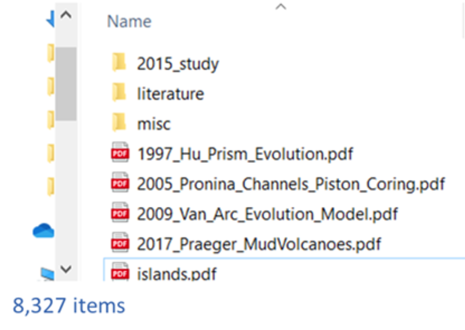
Documents are notoriously difficult to work with. Shared drives with mounds of pdfs, images, tiffs, etc. accumulate over the years with few options for how to view them outside of File Explorer.
Evaluation Criteria
Submissions will be enabled starting on March 22nd.
Submissions are expected to be a zip file containing the documented code and a link to an unlisted 2-4 minute Youtube video explaining the solution and why it is valuable.
Judging will be conducted by a multidisciplinary committee of Studio X designers, Studio X data scientists, and Shell subject matter experts.
Submissions will be judged on reproducibility, quality of documentation, complexity of data represented, and the quality of the visualization. Additional details about each of these categories are provided below. Please note that the questions under each category are representative and not necessarily “must haves.”
Reproducibility (assessed on 1-10 point scale)
Can we run your code locally?
Did you share a full environment setup and instructions on how to run?
Does the code run in a reasonable amount of time?
Is the code portable to other environments? (K8s, docker, mobile platform, etc...)
Quality of Code Documentation (assessed on 1-10 point scale)
Does your code have doc strings?
Does your code follow a style guide? (We like Google’s style guide)
Complexity of Data Represented (assessed on 1-10 point scale)
How complex is the data visualization?
How useful is the data visualization for exploration workflows?
How many data types are shown in the visualization?
How does your visualization display metadata?
Quality of Visualization (assessed on 1-10 point scale)
How creative is the solution?
How does the user interact with your visualization? Is it interactive?
How customizable is the solution? Can the solution be modularized for augmentation?
We encourage you to use the Xeek Discussion Board to ask any questions about this challenge. You are also welcome to email the Xeek team at hello@xeek.ai